Saturday, May 17, 2014

"Veil" by Som and Megan

"Veil" installation by Som and Megan, Witt Gallery, 2014
The "Veil" by Som and Megan, was a student installation in the Witt Gallery at Sacramento State. The installation took the viewer down a path of the maturing process of a girl. It makes reference to female representation in society and the struggle of women on the path to maturity. When I entered the Witt Gallery, I was taken down a path of flowers, which are typically associated with femininity. It lead me to the rest of the installation where the back wall was covered by news papers depicting stereotypes, advertising and news coverage of women. The white underwear that was clipped on the laundry line with clothing pins had red dye on the crotch which could have been making reference to the "flowering" of a girl through her period. The clothes on the on the wire could also have been referencing domestic chores that have been associated with women like laundry.
Detail of Underwear pinned on wire

Detail of path of flowers
The exhibition also makes reference to the violence that is often associated with, or is sometimes part of the feminine experience in the bold words "Fuck" and "Rape" shown on one of the wall. Even though they are strong words full of meaning I didn't see them at first because they were on the left wall in almost translucent tape. I took the meaning of this to be that rape is often a terrible part of some women's experience, but is not always noticed by society at all. The news papers hanging on the wall were wrinkled like a curtain coming down to reveal the lies that society still has about women. The content of the papers also reveals the different views of women that society has in the images and content.
Detail of "Domestic", "Fuck" and "Rape" written on the wall
The installation showed insight into the stereotypes and taboo subjects associated with women that are often not talked about in society. like rape and a women's menstrual period. This installation brought these issues out into the open and displayed them to be thought about and examined. One of the stereotypes of women that was brought up in this installation is the domesticity of women. This was seen from  the word "Domestic" on the wall, as well as the reference seen in the clothing on the laundry wire. The installation showed the students understanding of contemporary art and displayed feminist content.    

10th Annual Art History Symposium: Cross-Cultural Connections in Printmaking.

Sacramento State's Festival of the Art's, art history Symposium, had a speakers talk about a variety of subjects relating to the cultural connections of printmaking. The Symposium started with the keynote speaker Kathen Brown, then the four speakers John Byck, Pamela Ivinski, Louise Siddons and Mary Godwin gave their presentations. The speakers spoke about a range of topics from ship engravings to the printmaking in Los Angeles in relation to Maria Sodi de Ramos Martinez.

The keynote speaker Kathen Brown spoke about Crown Point Press. She talked about the artists that were represented there, the influence of Asian printmaking and the etching technique which became an art form at Crown Point Press. Pia Fries was one of the artist that was invited to work at Crown Point Press. She experimented with printmaking and learned how to etch with color. She created her own style that made the etching appear like paint brush strokes. Kathen Brown explained that she originally started Crown Point Press for her artist friends so that they could experiment with printmaking. In 1965, Brown published two pieces by Wayne Thiebaud who was the first artist that was invited to Crown Point Press in order for Brown to publish his works. Thiebaud was looking for distinction. He wanted to understand his painting and etching better so he could make new kinds of art works. He always started with a painting, and then created a print from it. Susan Middleton, who was another artist invited to Crown Point Press, liked the ink to be embedded  in the paper. She wanted a dye transfer to occur which meant that the ink would sink into the paper.

Kathen Brown spoke of a significant exhibition that Crown Point Press did called "Yes, No, Maybe". John Cage was the artist that represented the "yes" in the title of the exhibition. His style was to set something up and continue on it until it was satisfying. Richard Diebenkorn was the artist that represented the "Maybe" in the exhibition because he emphasized change in his work. The artist that represented the "no" in the exhibition was Chuck Close, who made collages with his printed self portrait. Brown also talked about an interesting tradition that they had at Crown Point Press, where they would take two artists a  year to Kyoto Japan to work with Japanese print makers. In 1987 Crown Point Press took artists to China to work with a print makers. The influence of Asian printmaking was important for Crown Point Press and presented a good opening for rest of the presentations on cross cultural printmaking.     

The Land - The People: Contenporary Korean Prints

The Land - The People Exhibition in the University Library Gallery
The exhibition was in the University Library Gallery through the dates of Febuary 6-May 17, 2014. It showed a range of ten contemporary artists from South Korea. Using different techniques, each of the artists expressed their style that shows  techniques of Asian printmaking, like wood block printing, linocut, digital and silicon prints. The art in The land - The People, shows a range of color, style and techniques that exhibits South Korea's unique printmaking.

Jung Won Chul, Portrait in Gray #2, 2001, Linocut
Jung Won Chul's print making style is realistic withe every line and feature emphasized in the depictions of the women's faces. He depicts older women in his linocuts that have survived the abuse of being forced prostitutes for the Japanese soldiers during WWII. The emotion that is conveyed in his depictions of these women is done through the detail and the size of the portraits. His portrait in Gray #2 shows this emotion in the facial expression, lines and value emphasized on the face. This style of realism is also seen in the powerful portraits in the piece "Face to Face" which is printed on long PVC sheets that are lined up, each showing a different realistic portrait of an elderly women. The lines and wrinkles are shown clearly on each of their faces. The material PVC (polivinyl chloride) makes the Linocut portraits clear because of the light the material captures.
Jung Won Chul, Face to Face, 2004, Linocut printed on PVC sheet
Detail of "Face to Face"
 The 12 woodcut prints by Ryu Yeun Bok show the Gumgang Mountain because it is the only part of North Korea in which South Koreans are allowed to go. The prints show different aspects of the location in a range of colors and values. The style references ancient prints and is reminiscent of Chinese and Korean landscape depictions. The prints emphasize the significance that a location can have to a culture, and shows the beauty and diversity that can be seen in nature.


Ryu Yeun Bok, Gumgang Mountain, 2007, Series of 12 woodcuts

Detail of Gumgang Mountain 12 woodcuts
The last art pieces that caught my attention at the exhibition of Korean printmaking, was Yoon Yeo Geul's, depictions of urban settings rather then natural landscapes. His complex webbed lines created a feeling of anxiousness when viewing the buildings and people that he reveals in his depiction of the South Korean city Seoul. At first glance I found it difficult to decipher the shapes and forms of the people within chaotic lines of the relief, but the appearance of the scrambled style gave the reliefs the frantic feeling that one might experience living in a modern and fast paced city.
Yoon Yeo Geul, from left to right, 11:37 am Jongrol, 2009, 5:22 pm Shinchon, 2009, and 2:01 pm Myungdong, 2009. woodcut.


Yoon Yeo Geul, Myungdong, 2009

Friday, May 16, 2014

Remembering TB-9

Remembering TB-9 lecture at Sacramento Sate
TB-9 is of national and international significance. It's heyday was in the 1960's where it become an important part of regional art history. The three guest speakers at Sacramento states lecture "Remembering TB-9" were graduate students who studied at TB-9 in Davis. Steve Kaltenbach, Peter VandenBerge, and Jerry Walberg established artists themselves, studied ceramics and sculpture at TB-9 during the revolution in clay. TB-9 was cutting edge in its time because sculpture and ceramics were being taught in a different way. It was the first historically significant art studio that was funded by a public university. Through the lead of Robert Arneson, who was influential in the revolution of clay and ceramics, the three students were able to be apart of a significant art historical project. . Robert Arneson did traditional ceramics as earthenware but abandoned it for more innovative ceramics. Arneson is also called the father of ceramic Avant garde because he was innovative with ceramics. Arneson was also very influential as a teacher to them. The three speakers said that he was master of his own work so he didn't teach in the conventional sense.

 Through a series of questions, the lecture was done as a conversation where the three speakers talked about their days studying at TB-9. When asked the question, "How did you come to study at TB-9? Peter VandenBerge was the first to speak. He explained that in the summer of 1962, he went to a fair where he saw Robert Arneson throwing pots. Ceramics at the time was equated with pottery and was decorative. He had never seen anyone do what Arneson was doing. When he talked to him, Arneson immediately suggested that he go to Davis for school and study at TB-9. VandenBerge agreed and became Arneson's first student. A point in which all three of the speakers agreed on was that it wasn't your average art program. Non of the rules that applied at other schools applied at TB-9. They said it was the attitude of TB-9 that made it diffferent. The studio was always open because Arneson worked a lot on his art. The studio was an open place where students could work at any hour of the day. It was not like a conventional classroom. The students at TB-9 inspired each other, and sometimes even copied each others ideas. There was good interaction between the students.    

The three speakers were asked "what else about TB-9 made it a good learning environment, and what was challenging"? Jerry Walberg answered that it was the graduate students that really made TB-9. That and the freedom to do what you wanted in the studio. They all agreed that Arneson was very open with students. When answering what about TB-9 was challenging, VandenBerge said that sometimes teachers would have them break their projects so that they don't grow to attached their work. They were supposed to work for the sake of learning. Sometimes they were forced to defend their work. TB-9 emphasized the work that went into ceramics and sculpture. they were asked what was the philosophy at TB-9. Steve Kaltenbach answered this point directly when he said "what's the philosphy of the department? no philosophy. Just work."despite the challenges that the three undertook while studying at TB-9, it was a valuable experience where they learned to be self disciplined in their work, and learned to be innovative and learn from there peers.
  

Sam Francis: Five Decades of Abstract Expressionism from California Collections

The exhibitions shows a collection of works that demonstrate Sam Francis's Abstract Expressionist style, and the progression of his paintings between the years of 1940 and 1990's. Sam Francis was a California artist whose art is colorful, gestural, and creative showing a range of shapes and lines. The show was featured at the Crocker Art Museum between January 26-April 20, exhibiting works of Francis from private and public collections. The Show displayed works from California like San Francisco, Point Reyes, and Santa Monica, but also featured works that were done in locations like Paris and Japan.

Sam Francis, Untitled 1979

This painting is an example of the work he did in California in the 1970's. Untitled 1979 was painted in his studio in San Monica on a large canvas that's 120" x 90". The painting is very big with large columns of splotched and splattered acrylic. The pattern of the painting appears erratic with color exploding all over the canvas. The color is however placed in a way that forms lattice work that is inspired by architectural elements. The pattern is made clear with splotches of Red, yellow, green, purple and multiple shades of blue. Even though the acrylic is applied in some areas with a more watery effect, the color is no less vivid. The color appears bright against the white background of the painting. When viewing it, I felt engulfed in the colorful experience. The canvas was so big that when I stood in front of it, the painting took up my field of vision. Sam Francis liked to paint on a large scale and often painted while lying on the floor because he wanted the painting to engulf him. The technique of painting from an aerial view came from his experience as a pilot during WWII.

Sam Francis, Untitled Self Portrait 1974

This painting was painting was done in Tokyo even though most of his painting in the 1970's were done in California. The painting is a self portrait of Sam Francis in acrylic on paper. The paint has a water color quality to it, making color value and the thick gestural strokes the stylistic focus. The vivid color gives the painting a dramatic and intense feeling. The expression on his face is emotional, almost pained. Sam Francis wanted to show his inner self in his self portrait. I could feel the emotion in the painting because of the intense color and his sad expression. The painting is a good example of his work later in his career and shows his interest in gestural strokes and vivid coloring.

Sam Francis, Mantis, 1960-61
This painting shows Francis's earlier work in his career. The painting is oil on canvas with a different painting style from his later work. I was immediately struck by this painting because it looked so different from his other work. Instead of splashes of different colosr that took up most of the space in the painting, this one showed solid shapes of color mostly in different shades of blue, with some green, yellow, purple, and red. The soft green shade references his interest in botany and medicine.The mantis at the bottom mimics the anatomical parts of a mantis holding on to its prey. The second difference I noticed in this painting is that it had a title unlike a lot of his later work. The title "Mantis" possibly comes from Greek origin meaning "mad" or "diviner".

Sam Francis, 3 Blue 1952
  This painting is oil on canvas and shows Sam Francis's earlier work where he expressed his experimentation with blue, the color he was known for favoring in his paintings. The painting appears monochromatic, made from a mixture of the colors white, grey black and blue. Some of the color is applied more solidly and some of the paint is applied in washes that allows the more saturated color to rise to the surface appearing suspended.

The Sam Francis Show at the Crocker Museum gave me an appreciation for Abstract expressionism that I would not have had if I hadn't looked at the actual paintings. Viewing the paintings in person allowed me to not only look at the shapes, color and application, but also be immersed in the experience because some of these paintings are painted in large scale with extremely vivid colors. It gave me a new appreciation for the style and is a show that I would recommend to others. 


Thursday, May 8, 2014

Bay Area Exhibition Review

 
Domestic Integrities Rug

The exhibition The Possible at the Berkeley art Museum is a combination of the different processes involved in the creation of art. Pottery and ceramics, the dying and manipulation of textiles, experimentation with text, and sound are all included in this multi-sensory experience. The expedition was planned by David Laurence the curator, and Lawrence Rinder who directed it. The Possible emphasizes experimentation with art forms and collaboration between artists and the community. Unlike traditional exhibitions, it does not simply display art work like sculptures and paintings in an empty museum space, but offers an interactive experience.The Possible is interactive where the viewer has the chance to be both the viewer and a contributor. The art accumulates over time so there aren’t just a few pieces to experience, but many increasing displays and workshops. The stations that involved different types of art making were divided into sections titled things like The Library, Display, Recording Studio, The Something, Ceramics studio, Print Shop, Textile studio and Dye Lab. Each station offered unique experiences for all the senses to understand art and the making of art. The Berkeley Art Museum offers workshops every Sunday until the 25th of May where the community can be led by artists in activities involving the different rooms. The rooms displayed both the contributions from the artists as well as contributions from volunteers and guests.

The Possible exhibition followed through different rooms that had different themes of art and sound production. The first room was titled “The Library” with shelves of books that people could pick out and photo copy. They could add it to the other contributions called “The Reader”. Surveys were done to find the inspirations of the artists. The surveys were put on the shelves for viewers of “The Library” to view, along with the copies that other guests contributed to the “installation”. Like the rest of the exhibition, this part of the Library room was expected to grow with workshops with the contributions made by visitors to the exhibition.A particular installation that stood out was the Fragrant Cabinet of Curiosities by Mandy Aftel and Jana Blankership. It was an interactive installation that differed from traditional gallery art. Many aspects of it encouraged the viewer not to simply view it but experience it with ones sense of smell. Mandy Aftel included a pamphlet of information about the scents that were on the display. Among them was Frankincense, cinnamon, jasmine, Ambergris, and Mint. She explains in the pamphlet that our sense of smell is one of our most important senses. She explains in the pamphlet the historical uses of the different plants that produce these scents. Outlined are the different ways that they can affect one’s body, mind and soul. The exhibition, although it invites you to smell and interact, it is also visually appealing. Arrays of colors are shown in the displays of butterflies, and in a color wheel. The different artifacts are displayed on the white cabinet. Glass bottles of herbs, ancient incense burners, and pinned butterflies make up the display. Even potted herbs that are labeled with their scent welcome you to participate in the art.

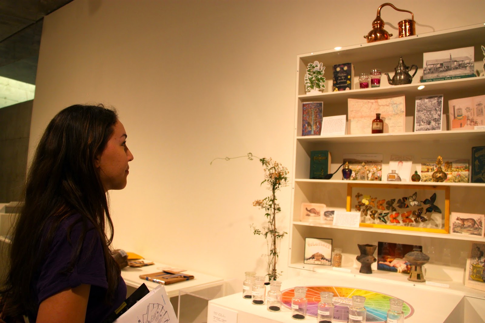
Me in Front of Fragrant Cabinet of Curiosities by Mandy Aftel and Jana Blankership


After the room that contains activities for “the Reader”, you move on to the next room of The Possible where a white Geometric structure with three tiers sits in the middle of the room. Unlike the library room, this installation fills up only the middle of the room with lots of empty space around it. It’s labeled Display and is a structure installation that was meant to be added to over time. The possible exhibition happens over the course of many weeks, so the Display is going to gather artwork from artists and the public over time and fill up all the tiers of the structure. Alexander Kori Girard is responsible for the structure design, while a crew with Kelly Bennett, Gary Bogus, Laura Hansen, Mike Meyers, and Scott Orloff, from the Berkeley Art Museum prepared the Structure. The Display is another example of the hands on gallery experience in The Possible. The ceramic sculptures and paintings that covered the top tier of the installation showed the encompassing effort of the community and artists to experiment and collaborate over time.
Me next to the Display by Alexander Kori Girard


The “Recording Studio” and “The Something” were two spaces next to each other that focused on the creation of sound and video. The “Recording Studio” had recording equipment for creating sounds and videos by artists and performers. Wires and sound equipment were placed on shelves against the wall. The “something” was connected to the Recording Studio and was filled with objects to created sound with. The floor was covered with sparkly foil that created a loud crumpling sound. Bean backs covered with foil and pieces of fabric were placed next to keyboards that could be played and used to record sound. A camera showed you enter the room on a projector. The room is filled with glittery objects, recording equipment and mirrors. A desk by the projector was covered with confetti and glittery cloth. The space feels the most tactile in the possible exhibition because of the all of the props to produce sound like the keyboards and the foil.
Detail of "The Something"


The lower level of the Berkeley Art Museum had the “Ceramics Studio” and the “Print Shop”. The Ceramics studio, like the other art rooms was dedicated to an art form where artists and the public could collaborate and create art. The ceramics masks and sculpture were displayed on shelves so that you could see the work that had been done in the studio. The “Print Shop” also focused on the collaboration of an art form. Shelves lined the wall with ink and stacks of paper and copy machines in the middle of the room. The other wall had a shelf with Scissors, staplers and whole punchers. Large prints of Abraham Lincoln that had been made with large rubber stamps covered the wall above the shelf. The rooms didn’t have any particular installation like the library or the Display. There purpose was more like the” Sound Studio” and “The Something” where the focus was on the creation of art and where its created rather than showing off the end product. 

Detail in "The Print Studio"


Detail of” Dye Lab”
The “Dye Lab” had the same concept as the Ceramics Studio and the Print Shop, where the tools for creating a type of object or art form were included in the room. Shelves with dyes, spools of thread, and plants for dying were placed near spinning wheels with wool, and a loom with half made cloth. The most eye catching part of this section was the installation near it that took up a large amount of space. The Domestic Integrities Rug by Fritz Haeg was made from clothing and textiles that were donated. The rug was woven from the donated clothes by Haeg and volunteers. The large colorful circular rug invites you to climb on to it (provided you remove your shoes), walk around on it and lay on it.

Detail of "The Dye Lab"